Roll Mobility - Go Further Together
Community driven mobile app for those experiencing mobility challenges
Project Background:
The Client:
Roll Mobility is a free mobile app designed to give wheelchair users and people with other mobility challenges up-to-date information about the accessibility of businesses in their community. Being able to quickly see whether a business has a large step at the entrance, or an accessible bathroom, allows those with mobility challenges to make informed decisions about what obstacles they may encounter–or avoid–when going out. Original Brief.
The Problem:
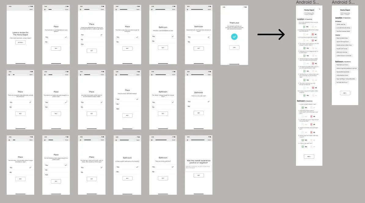
The current Roll app has a lengthy review process for users to submit the information they find when visiting businesses. The review requires more than 30 clicks/ 15 pages to complete and has confusing verifications during the process. Reviews are not sharable, and this prevents users from the information stored as they complete reviews. Initial Analysis (Figma)
The Solution:
The client would like to redesign the review to be quicker, easier (require fewer clicks), and give better user feedback while still gathering the same rich data about local businesses. The client would also like the opportunity to incorporate review sharing, so that the app can gain more visibility in users’ communities. These updates should decrease user attrition during the review process and increase user satisfaction with the product.
Project Duration: 80 hours
My Role: Sole UX/UI Designer
01 RESEARCH & DISCOVERY
User Interviews and Competitor Analysis were the used in primary research. User interviews were essential to empathize with wheelchair users, and hear about the experiences, desires, and pain points of the mobility impaired. Primary and secondary competitors were analyzed as well. This information revealed the market opportunities for Roll as well as new ideas for location review flows.
User Interviews
User Interview Goals:
1) Uncover the true pain points of navigating the world in a wheelchair or with other mobility challenges
2) Uncover what those with mobility challenges wish they had in their hands to help solve, plan for, or ameliorate these challenges of navigating the world
3) Uncover if there are other tools this group is currently using
“Disability isn’t picky- it doesn’t care who you are and it can happen to anyone at any moment”
Three interviews were conducted remotely. Two interviewees were wheelchair users. The third was born with a birth defect that causes him to use a prosthetic leg and is married to a wheelchair user.
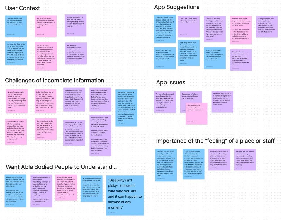
User Interviews Plan / User Interviews Insights & Transcript / User Interview Analysis & Affinity Map (Figma)
Interviewees had amazing suggestions about how the app could help the mobility community such as: sharing accessible events nearby, incorporating photo/video into reviews, highlighting “Roll Approved” locations, and even sharing out about grant money for business to make accessible accommodations to their buildings.
⅔ of the interviewees were familiar with Roll and cited that the review questions don’t always match the business type they are reviewing (ie dressing room questions at a restaurant ). There were also mentions that the map view isn’t particularly helpful (would rather search for a coffee shop than look at a bunch of icons that are nearby).
User Interview Questions:
As a wheelchair user, how often do you often encounter challenges-or anticipate encountering issues- when entering and visiting pulic spaces and businesses?
How have you been able to overcome these challenges at a location, or have you had to go to another business?
Are there digital tools you have used to help avoid or solve these situations? If yes: what’s been helpful, or what’s been missing about that tool?
If there were an app that had accessibility reviews from wheelchair users with photos of accessibility features and challenges would you use it? If yes, what would you want that app to have, show, or do?
Themes from the interview analysis revealed:
The very real pain point of getting accurate & up to date information from people who understand wheelchair use. For example Google Maps has an accessibility icon on their locations, but it often selected by the business and not the user. This means that while the owner may sight certain accessibility features, it doesn’t mean the user will be able to comfortably navigate the space. Examples include having tables too close together or only having high top tables. A bathroom might be spacious and have grab bars, but if it’s full of cleaning supplies it isn’t accessible.
Competitor Analysis
The second methodology used in primary reserach a Competitor Analysis to clarify Roll’s place and opportinity in the market. A selection of direct competitors (other mobility review apps) and indirect competitors (widely used apps like Google Maps and Yelp) were chosen to compare:
how reviews are written, styled & rated
how specific and general user input is/isn’t utilized in reviews and shown in summary
the length of time it takes to complete a review
how other accessibility apps contain the wide needs of wheelchair users to fit into a brief review
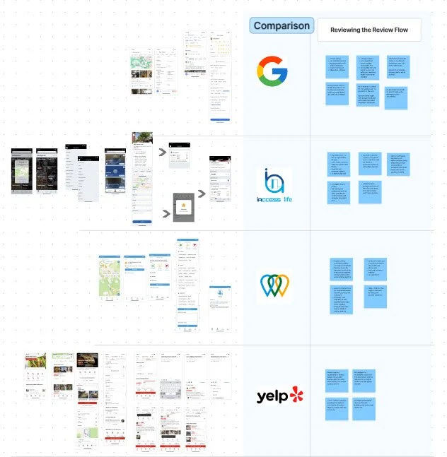
This exercise was both informative and inspirational as I explored different UIs, familiarized myself with different reviews, and internalized what made ‘good’ reviews most usable. Competitor Analysis (Figma)
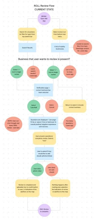
Visually comparing the review screens for a variety of apps (left) showed how inefficient Roll’s current design was (below). This underscored the need to simplify and condense the review question flow.
Thorough analysis showed the pros and cons of different designs and new options that had not yet been considered for the new design. Upon asking myself what Roll needed to learn from these examples, many take-aways became apparent:
Consider how a chip style review to reduce clicks and ‘carry’ information to multiple places in the app
Highligh the meaning(s) of the review icons which carry a few layers of information (location ratings, bathroom ratings, and indicators of full, partial and limited accessibility)
Include a review/location summary so the user is aware of the impact of their review and the rating that is given thanks to the information they provide
Include a long-form text answer so users can articulate their personal experiences and “speak” to the greater mobility community in the app
Balance subjectivity and objectivity so that the information remains informative to Roll’s audience. That is, highly subjective reviews (giving 1-5 star rating without answering specific questions) are not useful to Roll users. Yet, a review that has too many questions becomes a nuisance and can cause customer defection.
02 DEFINE
Defining the design needs for Roll was a lighter lift as this is already a functional and publicly available app. Their branding, and UI Kit are in place, and design assets were shared with me to utilize. With these pieces in place, I developed two Roll Mobility Personas to help guide the work and focus the design on user needs.
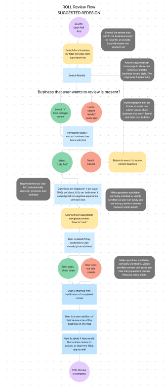
Next the Roll review user flow was mapped out and analyzed for confusion, inefficiency, and other design issues ( far left). A suggested user flow (near left) was developed to solve for problematic areas in the flow. This helped clearly define the overview of the new design.
Suggestions included:
Address the “random” list when opening search/review icon
Address the default “yes” on all review questions, which invites bad data/bad reviews
Make questions vertical and on one page so users can track progress on questions
Include a review confirmation where users can share the review and/or app and also see the impact of their review on a business’ accessibility rating
Include a “report an issue” or “submit feedback” area for users to communicate app issues
After the existing user flow was assessed, an exercise in UX Writing was done. Users identified that questions did not always match the type of location they were trying to review (for example dressing rooms at a restaurant, or tables at retailer). I distilled the most important and generic questions that applied to most situations into one set of questions. The client appreciated the exercise and agreed on its need, but determined that this was a backend issue related to how Foursquare was identifying businesses andpulling in the data.
Roll Original App Questions, Roll App Question Feedback, Roll Suggested Questions
03 DESIGN & DEVELOP
When design began, the research and deliverables were reviewed to ascertain which items were crucial improving the review. What did the user interviews, competitor analysis, personas and user flows indicate? What were the cruicial design needscame up again and again?
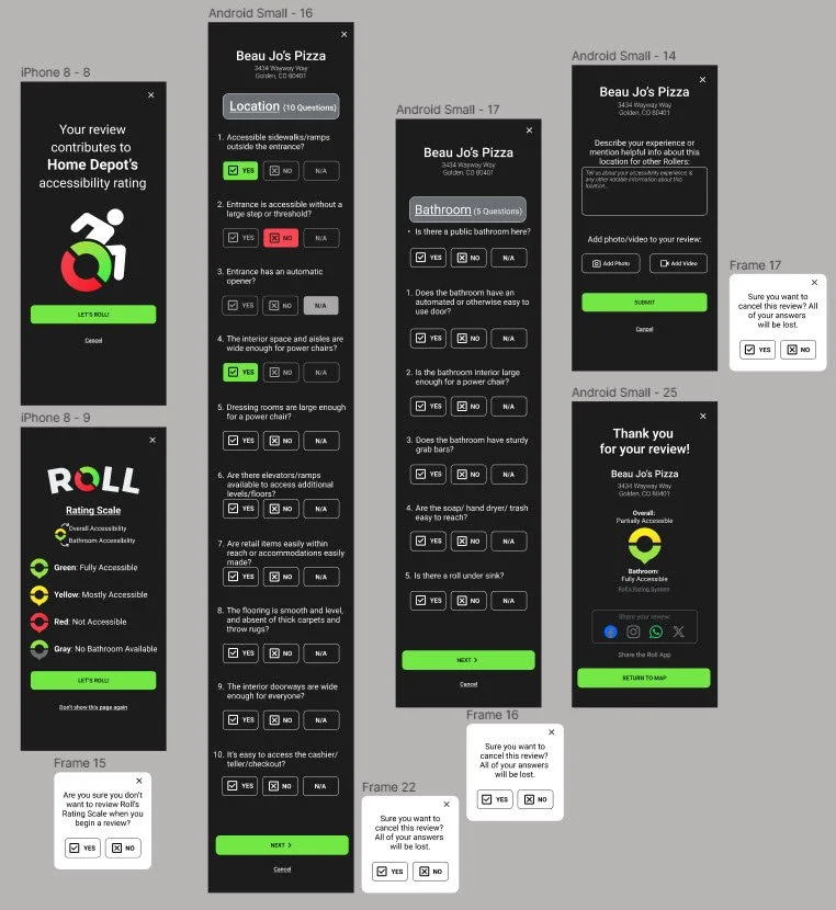
The first iteration moved 19 single pages of questions onto a single vertical page, reducing clicks by 50%. Using a single vertical page enabled users to view their progress during the review as they could scroll to the end of the form and see how many question remained.
The competitor analysis offered a chips design as an alternative to directly asking questions. A ‘B’ design was created for stakeholder consideration. While the chips were efficient and conveyed user selections visually, this version was not chosen as stakeholders felt it could not indicate overall accessibility as well as the straightforward yes/no answers. The chip were also problematic in their ability to be translated into a rating (fully/partially/not accessible), whereas the yes/no questions were tallied and assigned one of those categries.
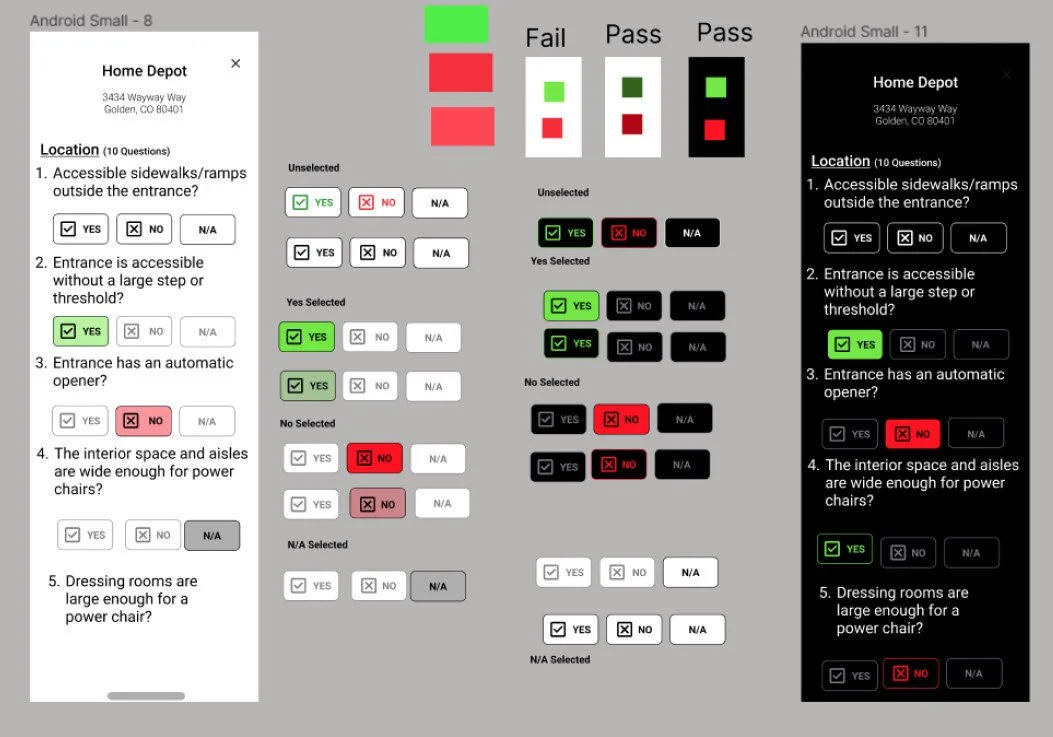
After getting client feedback and eliminating the chips design, the next focus of was to adjust the size, color, and spacing on the questions/answers. The design needed to be large enough to accommodate those with hand mobility, and feel more engaging than the plain white pages.
A light and dark mode were explored while simultaneoulsy assessing color accessibility and a variety of button designs. The color exploration lent to proceeding with the dark mode which more easily accommodated the existing brand colors. Future design will return and develop a light mode.
With the colors and buttons designed, it was time to complete the other pieces of the review. Enhancements to the final review flow included:
A consistent dark mode applied to all pages (not only the questions)
Automatic, and optional, user education of the rating system that displays before beginning a review
Option to exit/cancel (with a warning of losing process) placed throughout the review pages to be able to return to the map
A text box placed at the review endpoint to provide an opportunity of a personal narrative, or notes to other users (information that cannot be captured with yes/no questions)
Ability to attach photos/videos to the review, which benefits other users determining the accessibitlity of a business for their own unique abilities and challenges
A final review summary that shows users the impact of their review and allows them to share the review or the app on their socials and help build Roll’s community
04 TEST & DELIVER
Usability testing was done with two users already familiar with Roll’s current app and review design. The new design was shared in prototype format for users to experience on their phones. Users were asked for their impressions on the design changes and what was beneficial, unessessary or missing about the new design. 3/3 users were pleased with the many design enhancements such as the rating system education, the vertical page orientation for review questions, and large, colorful button designs on the review. The narrative text box and review summary also excited users.
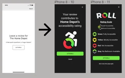
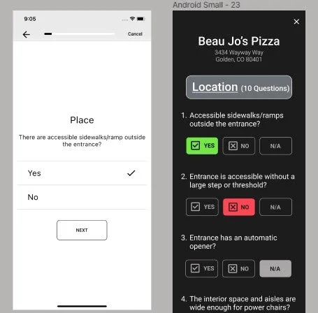
At left are the first two screens a user sees when beginning a review. Compared to the original, the new design is more appealing, sophisticated, and inviting. It is informative without being invasive.
You can notice the use inclusion of the brand logo and colors, and varied visual heirarchy that creates some movement on the page, as well as additional navigation option like cancel or changing the setting to now show the user education page.
The old deisgn required two clicks per page (a total of 37 clicks!) was plain black and white, autofilled “yes” for all answers, and did not show any type of progress or how many more questions were needed to complete a review.
The new design set all questions on one page (down to 17 clicks), and forced users to answer each question-no more bad data from auto populated answers! The answer buttons were color and icon coordinated to be more accessible (yes, green checkmark; no, red, X) and N/A was added as an answer option to reduce user confusion in situations where there was no clear yes or no for the question.
These users were familiar with the existing design, and therefore immediately appreciated and had an overall positive regard towards the new changes. The participants are also wheelchair users and passionate about different features that could be added to support the mobility community. The majority of these suggestions were outside of the scope of the project, but would be fantastic suggestions for the business to consider.
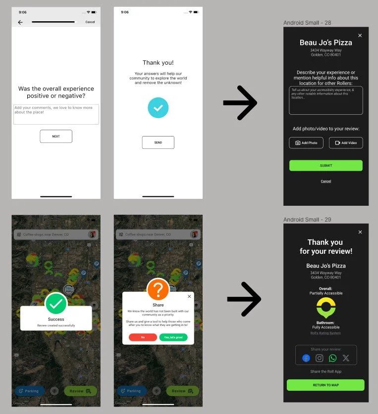
At left you can see the final screens in the review. One the far left the narrative question has been phrased, “Was the overall experience positive or negative?”. On the near left, it has been revised to elicit the story and important details of visiting that business, “Describe your experience or mention helpful info about this location for other Rollers.” Here, photo and video attachments are also possible.
The last screen of the old design shows a large question mark, several different off-brand colors and says, “We know the world has not been built with out community as a priority. Share us and give a tool to help those who come after you know what they are getting into." The buttons say “No” or “Yes, let’s grow”.
I wasn’t sure what was intended here. I spoke with the team and learned this was for sharing the app. I took this information and redesigned this last page to 1) show the impact of the reivew on the business rating, and 2) give users clear instructions to share the app or their review if they choose.
Future feature suggestions included:
Adding a light mode option for personal preference
Using the final rating summary to add to a location summary that could be viewed when searching for businesses, as well as highlighting certain hazards or amenities at reviewed locations
Reworking the review/map icons to be more accessible as the current colors do not pass WCAG and are not accessible to the color blind
Adding modals to prompt users to complete reviews at places they have visited, and be able to comment on reviews/locations without completing the full review flow
View the final Prototype here:
05 CONCLUSION
Though Roll did a great job of getting an MVP out and available to their community, the app needed a facelift to be more visually appealing, logical in use, and better leveraged to share out to the community and help the app scale. It was delightful to be on a project that was personally fulfilling and impactful.
Challenges:
Designing for an audience I cannot personally relate with was my biggest challenge with Roll. As an able-bodied person, I wanted to accurately represent the needs of the mobility challenged and use the correct language in my designs and was afraid that I wouldn’t. The beauty of UXD is that when you have a good process you deliberately get inside the heads of your users to be able to design for them with thier insight and input. Though I was intimidated by this situation, I learned to trust the design process and seek more information when needed. Low quality UX design will make many assumptions about users, solutions, and the implementation of design; high quality UX design will use research to validate designs and decisions and always have a why. I am thankful for this lesson in this project!
There were many adjustments I wanted to make to improve the app. It was a challenge to keep track of these ideas and was very helpful to have notations of my first impressions, as a reference and as a place to add ideas as needed. As the business implemented some of their own improvements, it was also helpful to have a complete set of original screenshots to track changes and have a reference.
Lessons Learned:
Looking back I would have documented our original conversation about the scope of the project. It was agreed that I would redesign the review section, but the review is connected to many aspects of the app so additional requests were made regarding the map, the profile, a feed of reviews, the business summary and so forth. Scope creep is a real risk and pleasing the client is a real desire. Signed documentation is necessary for both parties to define the work expectations.
Start imperfectly and follow the breabcrumbs! Whenever I was stuck in the design and knew my ideas hadn’t matured enough yet, I would feel frustrated and unhappy with my designs. However, getting ideas out—even silly or poorly excecuted—always, eventually led to something I was proud of in the end.
I found the competitor analysis crucial to creating a successful design for Roll. Familiarizing myself with primary and secondary competitors informed my understanding of what existed in the market for mobility apps, and what users were familiar with in terms of particiating in review flows. Instead of this being a “have to” in the process, I saw how crucial this is to informing the designer of the existing market and brainstorming new ideas. Each project is different, and it may not always be so helpful but it was so important this time!


